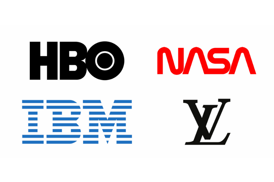
1. Letterform Logos (Monogram Logos)
Monograms aren’t just for towels anymore. Whether your brand’s initials form a catchy word like TASER, or your full name is a mouthful like Minnesota Mining and Manufacturing (3M), using initials can make your brand simpler and more memorable.
If your company name is long or better known by its acronym, a monogram logo might be the perfect fit. This style condenses your brand name into its most recognizable and pronounceable form, just like how we all say HBO instead of Home Box Office.
Typography plays a major role in monogram design. Since you’re working with fewer letters, you can experiment more with styling and creativity without worrying too much about readability. It’s no surprise that many luxury fashion brands like Louis Vuitton, Chanel, and Gucci use monogram logos as timeless, instantly recognizable emblems of their identity.
Why should you choose a monogram?
You want to maintain a clear connection between your name and your visual identity, but your full name is on the longer side. Or perhaps you’re in an industry where using initials is the norm — like many law firms do — making a shortened, refined version of your name the smarter choice.
Why might you avoid a monogram?
If you’re a new company and haven’t built strong recognition yet, you can still go with a letterform logo. However, it’s a good idea to include your full name beneath it until your brand becomes more established.
2. Wordmark Logos (Logotypes)
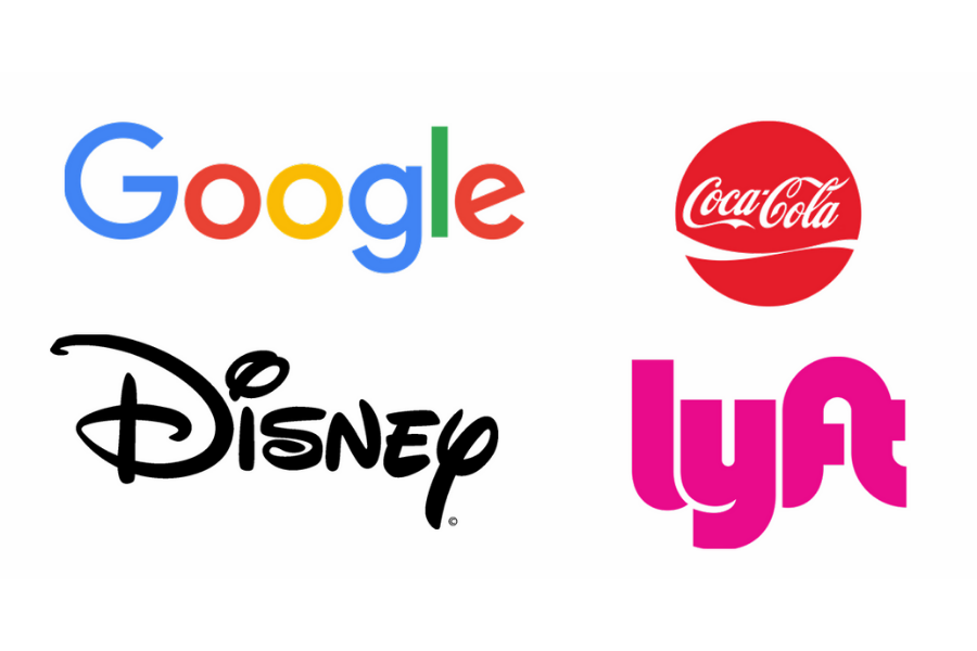
Also known as “logotypes,” wordmarks are logos made entirely from the company’s name. The design focuses on typography, making the brand’s visual identity closely tied to its name.
Because of this, choosing or creating the right font is crucial. The shape, style, and color of the text communicate just as much as the words themselves. This is especially important if your company name is a made-up word — like Google, for example.
Google’s logotype works because it’s simple, clean, and approachable. The use of multiple bright colors represents diversity, creativity, and accessibility, reflecting their goal of being a universal and user-friendly brand.
Why should you choose a logotype?
You’re a new company looking to build name recognition and visibility.
Your brand has a short, catchy name that stands out and won’t feel overwhelming when displayed everywhere.
If your name itself represents your brand — like a photographer or personal creator — a logotype is perfect for strengthening the connection between your name and visual identity.
Why might you avoid a logotype?
You prefer a timeless logo that won’t need frequent updates. Fonts often follow design trends — what’s popular today might look outdated tomorrow. Even brands like Google and Coca-Cola refresh their wordmarks occasionally to stay modern.
If your company name is long or complex, a logotype might not be the best choice, as it can appear cluttered or hard to scale effectively.
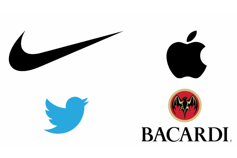
3. Symbols Logos (Abstract logomarks)
Abstract logos take inspiration from imagery but move beyond literal representation. They use shapes, forms, and colors to evoke emotion or symbolize an idea rather than depict something specific. These designs allow for greater creativity and flexibility, focusing on what the brand feels like rather than what it looks like.
The beauty of an abstract logo lies in its uniqueness — it gives your brand a distinctive visual identity that’s hard to replicate. Once people associate your symbol with your brand, you stand out effortlessly.
Take the Nike Swoosh, for example — it’s dynamic, simple, and instantly recognizable. Even without the name, the symbol alone conveys speed, motion, and energy. That’s the power of an abstract logo: it creates immediate and lasting recognition.
Why should you choose an abstract mark?
You want a visual element in your logo that conveys professionalism and depth rather than a literal image.
You’re aiming for something distinct and memorable — a design that stands apart as truly your own.
Why might you avoid an abstract mark?
Your brand identity is still evolving. Because abstract logos rely on emotion and perception, it’s important to first define the feelings and values you want your brand to evoke before creating imagery that represents them.
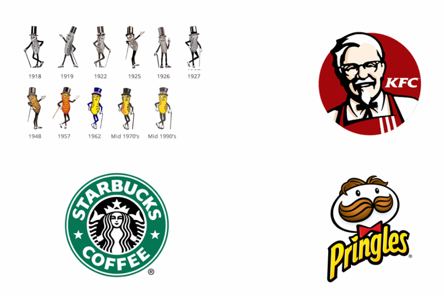
4. Mascot Logos
A mascot logo features a specific character — often a person, animal, or object with human traits — designed to create a friendly and relatable brand identity. As people, we naturally connect with faces, so mascots help form an emotional bond between the audience and the brand.
Unlike static pictorial logos, mascots are dynamic and can adapt their expressions and poses to fit different contexts — think of Mr. Peanut or the Michelin Man. They work especially well for sports teams, food brands, and service companies looking to appear approachable and memorable.
However, mascots can sometimes make a brand seem overly playful or less serious. If professionalism and authority are your brand’s main traits, another logo style might serve you better.
Why should you choose a mascot?
You want to connect with families or children.
Your brand personality is fun, friendly, and energetic.
You need a versatile logo that can evolve with your company and be adapted across various mediums and campaigns.
Why might you avoid a mascot?
Your brand needs to give off a serious vibe.
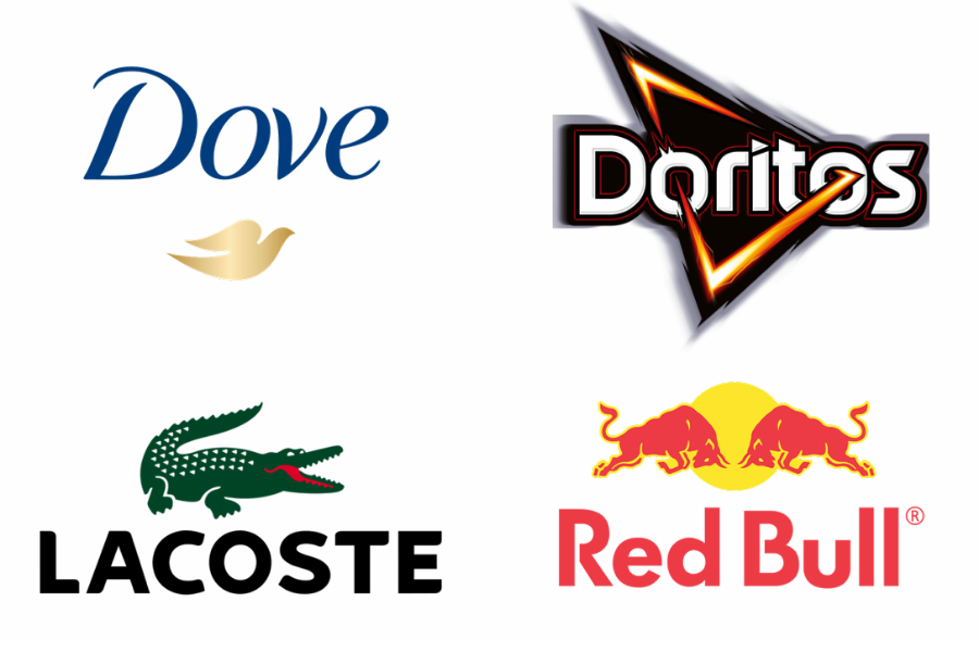
5. Combination Mark Logos
Not every brand fits neatly into one logo type — and that’s perfectly fine. You can mix and match different logo styles to create something that’s both distinctive and versatile. For example, you might combine a mascot with a wordmark, or merge your monogram into an abstract symbol. Many brands use this approach to maintain flexibility while ensuring strong recognition.
Think of Dove — their logo features both the dove symbol and the word “Dove.” The two work beautifully together, but each can also stand on its own depending on where it’s used. That’s the beauty of a combination mark: it gives you options.
If you’re drawn to using imagery but still want the clarity of text, a combination mark is an excellent choice. It’s ideal for growing brands that want to stay adaptable as their identity evolves — a perfect balance of creativity and clarity.
Why should you choose a combination mark?
You’re looking for the best of multiple worlds — a logo that blends versatility with longevity. You want a design that can evolve as your business grows, adapting to new markets, products, and audiences without losing its core identity.
Why might you avoid a combination mark?
Your brand values simplicity and clarity. Combination marks can sometimes feel cluttered or tricky to apply consistently — deciding when to use the full logo, just the wordmark, or the symbol can create confusion. If your goal is a clean, straightforward brand identity, a simpler logo type might serve you better.