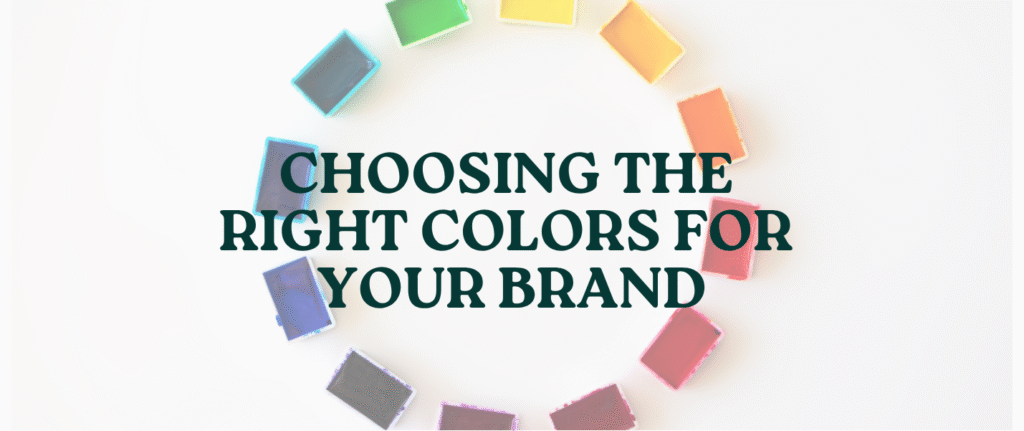
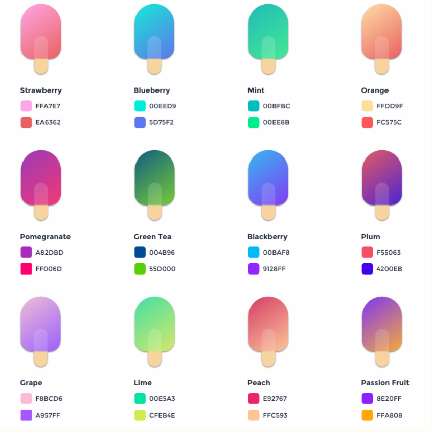
Colour Pallet
When purchasing a product, 93% of consumers base their decision on visual appeal, and over 84% say color is the key factor that catches their attention. Each color triggers a unique emotional response — red sparks appetite, blue inspires trust, green brings balance, orange radiates energy, and purple signifies luxury. Here’s a quick infographic to help you understand how colors influence perception and the vital role they play in branding and marketing.
The Psychology of Colors
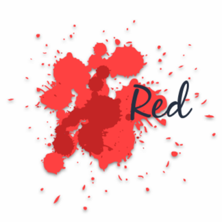
- 🍔 Encourages appetite — often used by fast food chains.
- ⏰ Creates a sense of urgency.
- 🏷️ Commonly used for clearance sales.
- 💃 Associated with movement, excitement, and passion.
- ⚡ High in energy and immediately pulls focus.
- ❤️ Physically stimulates the body — affecting nerve impulses, raising blood pressure, and heart rate.
- 🔵 Preferred by men.
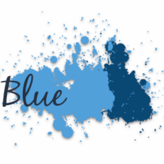
- 💧 Associated with peace, water, and reliability.
- 🤝 Builds trust and promotes confidence in a brand.
- 🧘♂️ Calms the mind and provides a sense of tranquility and openness.
- 🏢 Commonly used by corporate and professional brands.
- 🎓 Often associated with maturity and wisdom among young audiences.
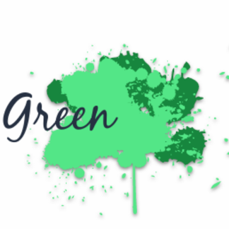
- 💚 Associated with health, tranquility, and nature.
- 💵 Linked to money, wealth, and prosperity.
- 🛍️ Used in stores to create a calming and relaxing atmosphere.
- 🌿 Commonly used to promote environmental and eco-friendly initiatives.
- 🧠 Stimulates harmony in the brain and encourages balance between body and emotions.
- 💜 Associated with royalty, wisdom, and respect.
- 🧩 Stimulates the brain’s problem-solving and creative thinking areas.
- 💄 Commonly used for beauty and anti-aging products.
- 🎨 Represents a creative, wise, and imaginative brand, service, or product.
- 🟠 Increases cheerfulness and optimism.
- ⚠️ Yellow can trigger caution or irritation (it even makes babies cry!).
- 🛍️ Often used to attract impulsive buyers and window shoppers.
- 🧠 Stimulates the brain’s logic center and promotes enthusiasm.
- 😬 Overuse can sometimes create a sense of anxiety or restlessness.
- ⚫ Associated with authority, power, stability, and strength.
- 🧠 Symbolizes intelligence and sophistication.
- 👗 Often used to create a slimming or sleek appearance.
- 😮 Can feel overwhelming or heavy when overused.
- ⚙️ Symbolizes practicality, timelessness, and stability in life.
- 🌫️ Too much grey can create a sense of emptiness or detachment.
- 🪞While elegant, it can also evoke feelings of aging, dullness, or melancholy.

- 🤍 Associated with purity, cleanliness, and safety.
- 🕊️ Represents neutrality and simplicity — the absence of color.
- 📄 Inspires creativity by offering a fresh, blank canvas for new ideas.
Colour pallets – Examples
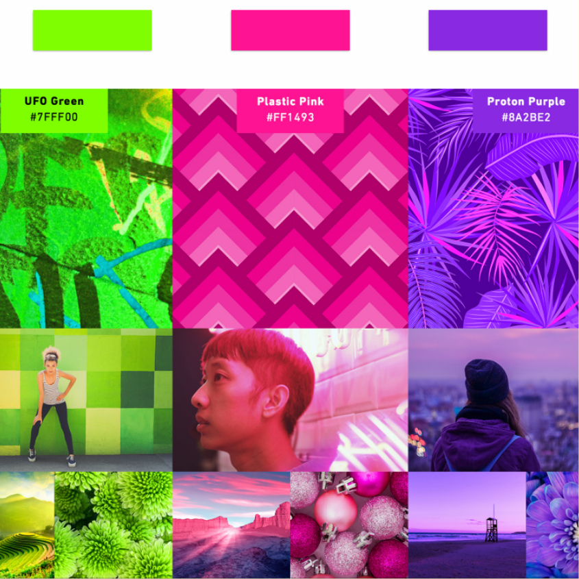
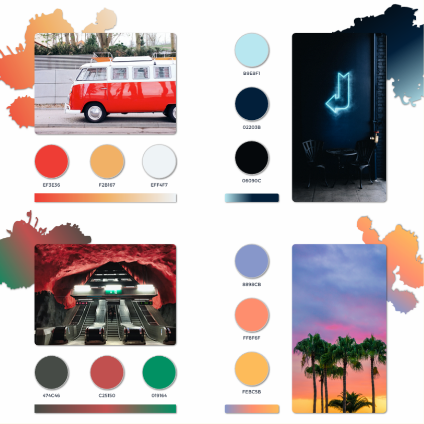
Colour pallets – Trends
Gokul Kumar
November 5, 2025Good Information